雅思小作文中的柱状图(Bar Chart)是数据类作文中常见的一种题型,主要考察考生对数据的描述、对比和分析能力,解答柱状图题目时,需要遵循“审题-找关键信息-结构安排-语言表达”的基本步骤,确保内容全面、逻辑清晰、语言准确,以下将从题型特点、解题步骤、范文解析、高分技巧及常见误区等方面展开详细说明。
柱状图题型特点与核心要素
柱状图通过不同高度或长度的柱子来表示各类数据的数值大小,通常用于展示多个类别在不同时间、不同群体或不同条件下的数据对比,其核心要素包括:类别(Categories)、数据单位(Unit)、时间范围(Time Period)(若有动态变化)、极值(Maximum/Minimum)以及数据间的差异或趋势,题目可能展示“某国2010-2025年可再生能源和化石燃料的发电量对比”,类别为能源类型,时间为2010-2025年,单位可能是“千兆瓦时(GWh)”,需重点对比两类能源的数值变化及差异。
解题步骤与结构安排
审题:明确题目要求与核心信息
- 圈画关键词:确定题目描述的核心对象(如“不同年龄组的运动频率”)、时间范围(如“2025-2025年”)及比较维度(如“性别差异”“城乡对比”)。
- 确认数据单位:注意单位是否统一(如“百万”“百分比”“千吨”),避免单位混淆导致数据描述错误。
- 判断图表类型:静态柱状图(单时间点多类别对比)或动态柱状图(多时间点变化趋势),前者侧重“对比”,后者侧重“趋势”。
观察与筛选数据:避免信息堆砌
- 分类归纳数据:按类别、时间或数值大小分组,例如将“高/中/低收入国家”作为类别,或按“2025/2025/2025年”时间轴梳理。
- 提取核心数据:包括最大值、最小值、数据接近的类别、显著变化的数值(如“增长最快”“下降最多”)等,无需描述所有柱子的具体数值,否则会冗余。
- 对比与关联:分析数据间的关系,如“A类别显著高于B类别”“C类别在2025年后呈现上升趋势”,体现数据的逻辑性。
结构安排:四段式框架
-
第一段:引言(Introduction) 说明图表反映的核心内容,公式:“The bar chart illustrates + [主题] + [时间/范围] + [核心对比对象]。”
“The bar chart compares the number of international tourists visiting five different countries (France, Spain, the USA, China, and Italy) in 2025 and 2025, measured in millions.” -
第二段:概述(Overview)
总结图表最显著的特征或整体趋势,2-3句话即可,无需具体数据,静态图可写“类别间差异显著”“某类别占比最高”;动态图可写“整体呈上升趋势/下降趋势”“某时间段变化剧烈”。
“Overall, France and Spain remained the most popular destinations in both years, while China experienced the most significant decline in tourist numbers between 2025 and 2025.” -
第三段:细节描述1(Details 1)
分组描述具体数据,优先写主要趋势或极值,可按类别分组(如“高收入国家vs低收入国家”),或按时间分组(如“2025年vs2025年”)。
技巧:使用“数据+对比”结构,如“A类别为X,明显高于B类别的Y”;“C类别在2025年为Z,2025年增长至W,增幅为XX%”。
“In 2025, France attracted 89 million international tourists, slightly more than Spain’s 83 million. The USA ranked third with 79 million, followed by Italy (62 million) and China (55 million). Notably, China’s figure was considerably lower than the top three countries.” -
第四段:细节描述2(Details 2)
补充次要数据或特殊变化,如“波动较小的类别”“与其他类别对比悬殊的数据”。
“By 2025, tourist numbers in all five countries had decreased compared to 2025, largely due to the COVID-19 pandemic. France still led the rankings but saw a decline to 76 million, while Spain’s numbers dropped to 75 million. The USA experienced the smallest decrease, falling to 73 million, whereas China’s tourist numbers plummeted to just 15 million, a significant reduction of over 40 million.”
语言表达:准确性与多样性结合
- 数据描述:避免重复使用“show/indicate”,替换为“illustrate/represent/demonstrate”;使用具体数据时,注意“约”的表达(如“approximately 50 million”“around 60%”)。
- 对比词汇:静态图用“higher than/lower than/similar to/outnumber”;动态图用“increase/decrease/remain stable/peak at”。
- 趋势词汇:动态图用“gradual steady/rapid/sharp/modest”修饰变化程度,如“a steady increase of 10%”“a sharp decline by 30%”。
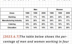
范文解析(以“某城市2025-2025年公共交通使用率”为例)
The bar chart shows the percentage of residents using different types of public transport (bus, metro, and tram) in City X from 2025 to 2025.
范文:
The bar chart illustrates the proportion of residents in City X who utilized buses, metros, and trams for public transportation between 2025 and 2025. Overall, buses were the most commonly used transport throughout the period, while trams consistently had the lowest usage rate. Additionally, metro usage experienced a notable upward trend, contrasting with the gradual decline in bus popularity.
In 2025, buses accounted for 45% of public transport usage, significantly higher than metro usage at 30% and tram usage at 15%. Over the next five years, bus usage declined steadily, dropping to 35% by 2025. This decrease was partly offset by the rising popularity of metros: metro usage grew from 30% in 2025 to 45% in 2025, surpassing buses to become the most preferred mode of public transport by the end of the period.
Tram usage, on the other hand, remained relatively low but showed slight fluctuations. In 2025 and 2025, tram usage stood at 15%, before increasing marginally to 18% in 2025. However, it then decreased to 16% in 2025 and 2025, before stabilizing at 17% in 2025. Notably, while buses and metros dominated the transport landscape, trams never exceeded 20% usage in any year, indicating their limited appeal to residents.
To summarize, the period 2025-2025 witnessed a shift in public transport preferences in City X, with buses losing ground to metros, and trams maintaining a minor but stable share of the market.
范文亮点:
- 结构清晰:四段式框架完整,引言点明主题,概述总结核心趋势(“bus最高,tram最低,metro上升”),细节段分“bus下降”“metro上升”“tram波动”展开,逻辑连贯。
- 数据对比精准:使用“significantly higher than”“surpassing”“marginally”等词汇体现数据差异,避免简单罗列数字。
- 趋势描述多样:动态趋势词汇丰富(“declined steadily”“grew from...to...”“fluctuated”“stabilizing”),展现语言能力。
高分技巧与常见误区
高分技巧:
- 数据分组描述:将相似数据合并描述(如“A和B均超过50%,而C不足20%”),避免逐柱罗列。
- 使用复合句:通过“while/whereas/although”等连接词体现数据关联,如“While bus usage decreased, metro usage increased by 15%”。
- 单位与极值突出:明确数据单位,并强调最大值、最小值或变化最显著的数据,如“the highest figure was recorded in buses (45%)”。
- 避免主观推断:仅描述图表数据,不添加个人观点(如“可能是因为地铁更便宜”),保持客观性。
常见误区:
- 忽略概述段:概述是得分关键,若缺失会影响任务完成度分数(TR任务回应)。
- 数据堆砌:逐一描述每个柱子的数值,未提炼核心特征,导致内容冗长。
- 单位混淆:未注意题目中的单位(如“千” vs “百万”),导致数据描述错误。
- 时态错误:动态图中,过去时间用“过去时”,普遍事实用“一般现在时”,避免时态混乱。
相关问答FAQs
Q1: 柱状图中数据很多,如何避免遗漏重要信息?
A: 首先快速浏览图表,按“类别/时间”分组,优先提取最大值、最小值、变化趋势最明显的数据(如“增长最快”“下降最多”),以及数据间的显著对比(如“A是B的两倍”),次要数据(如波动较小、数值接近的类别)可合并描述,Other countries had relatively similar figures, ranging from 10% to 15%”,无需逐一展开。
Q2: 柱状图出现“负增长”或“零值”,如何准确描述?
A: 负增长需明确写出“decrease by”或“drop to”,并标注负号(如“a decrease of -5%”),或用“fall below zero”表示负值;零值可直接描述“reached zero”或“remained at 0%”。“In 2025, the company’s profits decreased by -20%, dropping to -$2 million, while in 2025, the figure returned to positive growth, reaching $1 million.” 注意单位与符号的准确性,避免歧义。