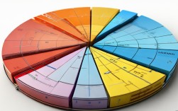
饼状图作文英语
在英语写作中,饼状图(Pie Chart)是一种常见的数据可视化工具,常用于展示整体中各部分的占比关系,无论是学术写作、考试作文还是商业报告,掌握饼状图的描述方法都是一项重要技能,本文将详细介绍饼状图作文的结构、常用词汇、写作技巧,并通过实例帮助读者提升写作能力。

饼状图作文的基本结构
一篇优秀的饼状图作文通常包含三个部分:引言(Introduction)、主体(Body)和结论(Conclusion)。
-
引言部分需要简要介绍饼状图的主题、时间范围和数据来源。
The pie chart illustrates the proportion of energy sources used in a country in 2025. -
主体
主体是作文的核心,需详细描述饼状图中的数据,可以按占比从高到低的顺序排列,或按类别分组说明。
Coal accounted for the largest share at 45%, followed by natural gas at 30%. Renewable energy, including solar and wind, constituted only 15% of the total. -
结论部分需总结主要趋势或对比数据,并提出可能的解释或预测。
It is evident that fossil fuels dominated energy consumption, but the growing use of renewable energy suggests a shift toward sustainability.
常用词汇与句型
描述饼状图时,需使用准确的数据表达和对比词汇,以下是一些常用表达:
| 类别 | 词汇/句型示例 |
|---|---|
| 占比 | account for, constitute, make up, occupy, represent |
| 对比 | while, whereas, compared to, in contrast to |
| 最高/最低占比 | the largest/smallest proportion, the majority/minority, the highest/lowest percentage |
| 数据范围 | approximately, around, roughly, just over, just under |
Oil constituted approximately 25% of the total, which was slightly higher than nuclear energy at 20%.
写作技巧与注意事项
- 避免重复:使用同义词替换高频词汇,如用“comprise”代替“account for”。
- 数据对比:通过对比突出差异,如The percentage of A was twice that of B.
- 逻辑清晰:使用连接词(如however, moreover)增强段落连贯性。
- 客观描述:避免主观臆断,仅基于图表数据进行分析。
实例分析
以下是一个关于“全球水资源使用分布”的饼状图作文片段:
The pie chart presents the global distribution of freshwater usage in 2025. Agriculture consumed the largest portion, accounting for 70% of total usage, primarily for irrigation. Industry followed with 20%, while domestic use constituted the remaining 10%. Notably, agricultural usage was significantly higher than industrial and domestic sectors combined, highlighting the critical role of farming in global water demand.
相关问答FAQs
Q1: 如何在饼状图作文中处理多个数据类别?
A1: 当数据类别较多时,可将相似类别合并(如将“太阳能”和“风能”归为“可再生能源”),或按占比分组描述(如“前三名占60%,其余占40%”),避免信息过于琐碎。
Q2: 饼状图作文是否需要添加个人观点?
A2: 通常不需要,饼状图作文以客观数据描述为主,但结论部分可简要提及数据反映的趋势或潜在影响(如This trend may indicate increasing environmental awareness)。