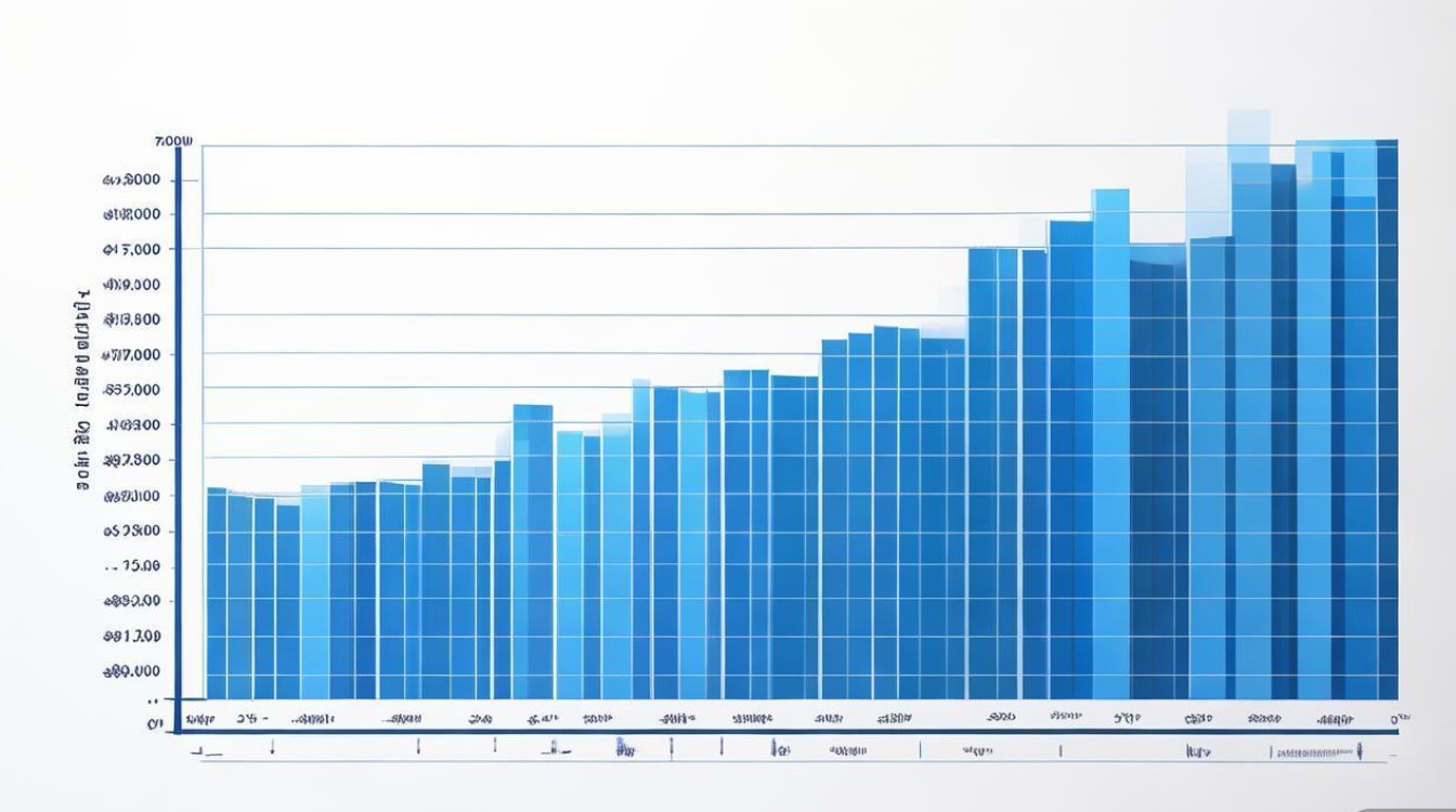
下面我将为你提供一份全面、系统、可操作的柱形图作文写作指南,包含结构、词汇、句式、范文和实战练习,助你攻克这一题型。

第一部分:柱形图作文的核心要素
在动笔之前,你必须明确一篇高分柱形图作文需要做到以下几点:
- 客观描述: 准确无误地报告图表中的关键信息,如最高值、最低值、最大差异、显著变化等。切忌主观臆断或添加图表中没有的信息。
- 数据支撑: 你的所有描述和分析都必须基于图表中的数据,学会引用数据来支持你的观点。
- 比较与对比: 柱形图的核心在于比较,你需要比较不同类别、不同时间点的数据大小、变化趋势等。
- 结构清晰: 文章需要有清晰的开头、主体和结尾,逻辑连贯,层次分明。
- 语言准确: 使用恰当的词汇和句式来描述数据、趋势和比较关系。
第二部分:标准结构与写作步骤
一篇标准的柱形图作文通常包含三个段落:
开头段 - Introduction (约2-3句话)
目的: 简要介绍图表内容,让读者对图表有一个基本了解。
写作步骤:
- 改写题目: 将题目中的描述用自己的话重新表述一遍。
- 点明图表类型和时间范围: 明确指出这是一个柱形图,并说明它所涵盖的时间段(如果有的话)。
- 概括图表核心内容: 用一句话总结图表最主要展示的信息是什么。
常用句式:
- The bar chart illustrates/compares/shows the [data] of [categories] over the period of [time].
- As is shown/depicted in the bar chart, it provides information about...
- The chart below presents the changes in [what is being measured] for [what is being compared].
主体段 - Body (约3-5句话,或分成2-3段)
目的: 这是文章的核心,你需要详细分析图表中的数据,进行比较,并指出主要特征和趋势。
写作策略(非常重要!): 不要按照图表的顺序逐一描述每个柱子,这样会显得非常啰嗦且没有重点,你应该按“特征”或“趋势”来组织段落。
-
分组描述
- 将数据分成几组,每组有共同的特征(如:一组数据高,一组数据低;一组数据增长,一组数据下降)。
- 第一段描述市场份额最高的几个国家,第二段描述市场份额最低的几个国家。
-
按时间/类别顺序
- 如果图表有明显的时间顺序或逻辑顺序,可以按照这个顺序来写。
- 描述一个国家从2010年到2025年的数据变化趋势。
写作步骤(以一段为例):
- 主题句: 用一句话概括本段的核心观点或要描述的主要特征。
- 数据支撑: 引用具体数据来支撑你的主题句。先说结论,再给数据。
- 比较与分析: 对数据进行比较,解释数据之间的关系或背后的可能原因(考试中通常不要求深究原因,点到为止即可)。
常用句式和词汇:
- 描述最高/最低点:
- [A] witnessed the highest figure, reaching [number].
- [B] ranked the lowest, at only [number].
- The peak/maximum was achieved by [A].
- 描述比较:
- [A] was significantly higher/lower than [B].
- There was a slight/notable/substantial difference between [A] and [B].
- [A] outnumbered [B] by [number].
- 描述趋势:
- [A] experienced a sharp/steep/dramatic increase/decline.
- [B] showed a steady/slow/gradual growth/fall.
- [C] remained stable/constant over the period.
- [A] peaked at [number] in [year].
- [B] bottomed out at [number] in [year].
结尾段 - Conclusion (约2-3句话)
目的: 总结图表的主要发现或得出一个总体的结论。
写作步骤:
- 重申核心趋势: 用不同的措辞重复一下图表中最显著的特征或总体趋势。
- 得出结论: 基于数据,给出一个简短的、概括性的结论。
常用句式:
- In conclusion/To sum up/Overall, it is clear that...
- To summarize, the most striking feature is that...
- In a nutshell, [A] was the most popular choice, while [B] was the least favored.
第三部分:核心词汇与句式宝典
动词 - 描述趋势
| 上升 | 下降 | 波动 | 稳定 |
|---|---|---|---|
| increase (上升) | decrease (下降) | fluctuate (波动) | remain stable/constant (保持稳定) |
| rise (上升) | decline (下降) | vary (变化) | stay the same (保持不变) |
| grow (增长) | drop (下降) | go up and down (起伏不定) | level off (平稳下来) |
| climb (攀升) | fall (下降) | peak (达到顶峰) | plateau (进入平台期) |
| surge (猛增) | slump (暴跌) | bottom out (触底) | |
| soar (飙升) | plummet (骤降) |
修饰词 (非常重要!):
- 急剧地: sharply, rapidly, dramatically, drastically, steeply
- 显著地: significantly, considerably, markedly
- 缓慢地: slowly, gradually, slightly
- 平稳地: steadily, moderately
比较与对比
- A > B: A was higher/larger than B. / A outnumbered B. / A was three times as large as B.
- A < B: A was lower/smaller than B. / A was a fraction of B.
- A ≈ B: A was similar to B. / A and B were almost/equal. / There was little difference between A and B.
- 最...: the most..., the largest..., the highest...
- 最不...: the least..., the smallest..., the lowest...
引用数据
- The number of [A] stood at [number].
- [A] accounted for [number/percentage].
- [A] made up [number/percentage] of the total.
- The figure for [A] reached [number].
- There were [number] [A]s.
第四部分:范文解析
** The bar chart below shows the percentage of adults in a certain country who used the internet from 2010 to 2025.
图表信息(假设):
- 2010: 30%
- 2011: 40%
- 2012: 55%
- 2025: 65%
- 2025: 75%
- 2025: 85%
高分范文:
(Introduction) The bar chart illustrates the proportion of adults in a particular country who accessed the internet over a six-year period, from 2010 to 2025. Overall, it is clear that there was a significant and continuous increase in internet usage among the adult population during this time.
(Body) A closer look at the data reveals a consistent upward trend. In 2010, only 30% of adults used the internet. This figure then experienced a steady rise, climbing to 40% in 2011 and further increasing to 55% by 2012. The growth became even more pronounced in the subsequent years. Between 2012 and 2025, the percentage surged from 55% to 85%, marking a substantial jump of 30 percentage points in just three years. Notably, the year 2025 saw the highest usage rate, with 85% of adults online.
(Conclusion) In conclusion, the chart demonstrates a clear and positive trend in internet adoption among adults in the country, with the percentage of users more than doubling over the six-year period.
第五部分:实战练习
** Write a report for a university lecturer describing the information below. Write at least 150 words.
图表信息: The chart shows the number of men and women in further education in three countries – the UK, Canada, and Japan – in the years 1999, 2004, and 2009.
- UK:
- 1999: Men 100k, Women 150k
- 2004: Men 120


