雅思饼状图作文是雅思小作文中常见的图表类型,主要考察考生对数据描述、对比分析及逻辑组织的能力,以下将从饼状图的基本结构、核心词汇、常用句型、分段模板及注意事项等方面提供详细指导,帮助考生高效备考。
饼状图作文基本结构与内容布局
饼状图通过展示整体中不同部分的占比关系,突出数据的主次特征,通常采用“总-分-总”结构,分为三段:
-
第一段:概述图表信息(约1-2句话)
- 明确图表类型(饼状图)、主题及时间范围(若有)。
- 概括最核心的数据特征(如最大/最小占比、整体趋势)。
示例:The pie chart illustrates the proportion of energy consumption from different sources in a country in 2025.
-
第二段:细节描述与对比(约3-5句话)
- 按“从高到低”或“逻辑分组”顺序描述数据,避免逐一罗列。
- 对比显著差异(如A是B的X倍)、相似点(如C与D占比接近)及极端值(如最小占比不足5%)。
- 使用数据支撑结论,避免主观臆断。
示例:Oil accounted for the largest share at 40%, followed by natural gas (25%) and coal (20%). Renewable energy, though the smallest, contributed only 15% to the total.
-
第三段:总结归纳(约1-2句话)
 (图片来源网络,侵删)
- 重申核心发现,无需重复数据,可补充隐含意义(如反映某趋势或问题)。
示例:Overall, fossil fuels dominated the energy structure, indicating a high reliance on non-renewable resources.
- 重申核心发现,无需重复数据,可补充隐含意义(如反映某趋势或问题)。
核心词汇与表达
描述占比
- 占比:account for / constitute / make up / comprise / represent
- 占比最大/最小:account for the largest/smallest proportion / constitute the majority/minority
- 占比接近:be similar to / be comparable to / account for a similar proportion
- 具体比例:comprise one-third / account for just over a quarter / constitute approximately 15%
对比与趋势
- 倍数关系:A was twice as much as B / A accounted for three times the proportion of B
- 差异显著:A significantly outweighed B / There was a stark contrast between A and B
- 趋势暗示:suggest a shift towards / reflect a growing preference for / indicate a decline in
数据范围
- 约数:approximately / roughly / about / around / nearly / just over/under
- 精确数:exactly / precisely / precisely 30%
高分句型模板
开篇引入
- The pie chart provides a breakdown of [主题] in [时间].
- As is depicted in the pie chart, [主题] was divided into [X] categories, with [最大占比部分] being the most prominent.
细节描述
- [部分A] constituted [比例], which was [倍数/比较关系] higher/lower than [部分B].
- The proportion of [部分C] was [比例], closely followed by [部分D] at [比例].
- It is worth noting that [最小部分] accounted for the smallest share, at merely [比例].
总结归纳
- To sum up, the data reveals that [核心结论].
- Overall, [主要部分] dominated the chart, highlighting [隐含意义].
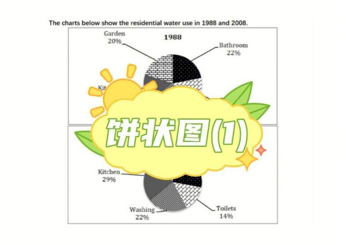
分段模板示例(以“2025年某国能源消耗”为例)
第一段(概述)
The pie chart illustrates the energy consumption structure of a country in 2025, with data divided into four sources: oil, natural gas, coal, and renewable energy.
第二段(细节)
Oil constituted the largest proportion, accounting for 40% of the total consumption. Natural gas and coal followed, representing 25% and 20% respectively. Notably, renewable energy, though promoted as a sustainable alternative, contributed only 15%, making it the smallest segment. The data indicates a heavy reliance on fossil fuels, as oil, natural gas, and coal together made up 85% of the energy usage.
第三段(
In conclusion, fossil fuels played a dominant role in the country's energy supply in 2025, while renewable energy adoption remained limited.
注意事项
- 避免数据堆砌:选择3-4个关键数据(最大、最小、显著差异)进行描述,无需提及所有部分。
- 时态统一:若描述过去数据,用一般过去时;若为预测或无时间数据,用一般现在时。
- 单位与逻辑:确保数据单位一致(如百分比、具体数值),段落间用逻辑连接词(However, Similarly, In addition)过渡。
- 字数控制:小作文建议150-200词,每段不宜过长,重点突出对比与趋势。
相关问答FAQs
Q1: 饼状图如果有多个图表(如不同年份的对比),如何处理? 包含多个饼状图(如2025年与2030年对比),需分段对比各图表的核心差异,第一段概述两图主题,第二段分别描述2025年与2030年的数据分布,第三段总结变化趋势(如“可再生能源占比从15%增至30%,表明能源结构优化”),注意使用“while”连接对比数据,避免重复句式。
Q2: 饼状图数据复杂(如部分占比接近或存在微小差异),如何高效描述?
A: 对于接近的数据,可采用“grouping”策略,若A占22%、B占21%、C占20%,可合并描述为“A, B, and C accounted for similar proportions, ranging between 20% and 22%”,对于微小差异(如A占30.1%,B占29.9%),用“approximately 30%”或“just over/under 30%”简化,避免过度纠结精确值,重点突出整体对比关系。