In the realm of data visualization, few tools are as universally recognized and effectively utilized as the pie chart. A pie chart, also known as a circle chart, is a circular statistical graphic divided into slices to illustrate numerical proportions. Each slice of the pie represents a category's contribution to the whole, with the size of the slice corresponding to the percentage or proportion it signifies. This visual representation is particularly powerful because it allows viewers to quickly grasp the relative magnitudes of different components within a dataset, making complex information digestible at a glance. The simplicity and intuitiveness of pie charts have cemented their place in academic research, business presentations, media reports, and educational materials, where they serve as a bridge between raw data and meaningful insights.
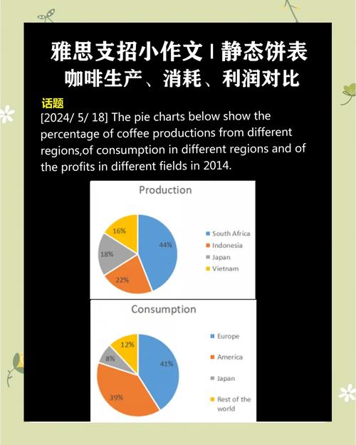
The fundamental strength of a pie chart lies in its ability to display part-to-whole relationships. For example, in a market analysis, a pie chart can effectively show the market share of different companies, enabling stakeholders to identify dominant players and niche competitors at a glance. Consider a scenario where a smartphone manufacturer wants to present its sales distribution across various regions. By using a pie chart, they can visually represent that 40% of sales come from North America, 30% from Europe, 20% from Asia, and 10% from other regions. This immediate visual comparison allows the audience to understand the regional importance without needing to scrutinize numerical tables. The human brain is naturally adept at comparing angles and areas, making pie charts an efficient tool for such proportional comparisons.
However, the effectiveness of a pie chart is contingent upon proper design and adherence to best practices. One critical guideline is to limit the number of slices to avoid clutter. A pie chart with too many categories can become confusing, as small slices may be difficult to distinguish and label. Experts recommend using no more than five to seven slices, with larger slices grouped into an "other" category if necessary. Additionally, the slices should be ordered logically, often starting with the largest slice at the 12 o'clock position and proceeding clockwise in descending order. This arrangement creates a visually balanced and easy-to-follow layout. Color choice is another crucial element; distinct, contrasting colors should be used for each slice, and a legend should be provided to clarify what each color represents. Accessibility considerations, such as ensuring colorblind-friendly palettes, are also essential to make the chart inclusive.
Despite their advantages, pie charts are not without limitations and are best suited for specific types of data. They are most effective when the categories are mutually exclusive and collectively exhaustive, meaning each data point fits into only one category, and all possible categories are included. Pie charts are less suitable for datasets with many small categories or for showing changes over time, as comparing the sizes of slices across multiple pie charts can be challenging. In such cases, alternative visualizations like bar charts or stacked area charts may be more appropriate. For instance, if a company wants to track its quarterly revenue growth, a bar chart would better serve the purpose than a series of pie charts, as it allows for easier comparison of values across time periods.
To illustrate the practical application of pie charts, let us consider a case study involving a nonprofit organization aiming to analyze its funding sources. The organization's annual report reveals that donations from individual contributors account for 50% of total funding, grants from foundations make up 30%, corporate sponsorships contribute 15%, and government aid provides the remaining 5%. By presenting this data in a pie chart, the nonprofit can clearly communicate its financial reliance on individual donors, which is valuable information for stakeholders and potential donors. The visual impact of the pie chart reinforces the message that individual support is the backbone of the organization's operations, potentially encouraging more contributions in the future. This example highlights how pie charts can transform abstract numbers into compelling narratives.
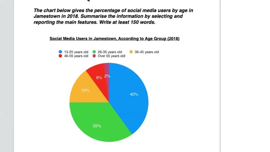
In academic contexts, pie charts are frequently used to simplify complex data for research papers and presentations. For example, a sociology study examining the distribution of household income brackets might use a pie chart to show that 20% of households fall into the low-income category, 50% into the middle-income, and 30% into the high-income bracket. This visual representation helps readers quickly understand the income distribution without getting lost in statistical details. Similarly, in environmental science, pie charts can illustrate the composition of waste, showing the percentage of recyclable materials, organic waste, and non-recyclable waste. Such applications demonstrate the versatility of pie charts in making specialized data accessible to broader audiences.
The creation of pie charts has been revolutionized by digital tools, which offer advanced features for customization and interactivity. Software like Microsoft Excel, Google Sheets, and specialized data visualization platforms allows users to generate pie charts with just a few clicks. These tools enable the adjustment of colors, labels, and even the inclusion of interactive elements, such as hover-over effects that display exact percentages. For instance, an interactive pie chart on a website could allow users to click on a slice to filter related data, enhancing user engagement and providing deeper insights. The integration of pie charts into dashboards and reports has also become commonplace, enabling real-time data monitoring and decision-making.
Despite the rise of more complex visualizations, the pie chart remains a staple in data communication because of its simplicity and familiarity. Its widespread use across various industries and disciplines underscores its value as a foundational tool for data presentation. However, it is important for users to recognize when a pie chart is the best choice and when alternative visualizations might be more effective. By understanding the strengths and limitations of pie charts, individuals can make informed decisions about how to present their data most effectively. In an increasingly data-driven world, the ability to communicate information clearly and persuasively is a critical skill, and the pie chart continues to be an essential part of that toolkit.
In conclusion, the pie chart is a powerful and versatile tool for visualizing proportional data. Its ability to convey part-to-whole relationships in an intuitive manner makes it a favorite among professionals, educators, and communicators. While it is important to use pie charts judiciously and follow best practices in their design, their impact in simplifying complex data cannot be overstated. As technology continues to evolve, the pie chart will likely adapt and remain relevant, continuing to serve as a cornerstone of data visualization for years to come. Whether in business, academia, or media, the pie chart will undoubtedly continue to play a vital role in turning data into understanding.
FAQs
-
What are the common mistakes to avoid when creating a pie chart?
Common mistakes include using too many slices, which can make the chart cluttered and hard to read; failing to order slices logically, leading to visual confusion; using similar colors that are difficult to distinguish; and not including a legend or labels, making the chart unclear. Additionally, pie charts should not be used to show data that changes over time or to compare multiple datasets, as bar charts or line graphs are more suitable for these purposes. -
When should I use a pie chart instead of a bar chart?
A pie chart is ideal when you need to show the proportion of parts to a whole, especially when there are few categories (typically five or fewer) and the emphasis is on relative percentages. For example, displaying market share or budget allocation. A bar chart, on the other hand, is better for comparing categories across different groups or showing trends over time, as it allows for easier comparison of values and can accommodate more categories without becoming cluttered. Choose a pie chart for simplicity in part-to-whole relationships and a bar chart for detailed comparisons.
